Prompt guide
Complete guide for Branded Snack Technical Infographic
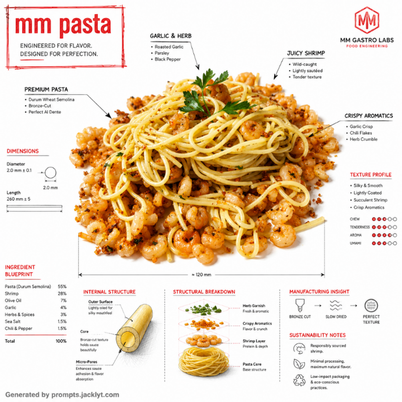
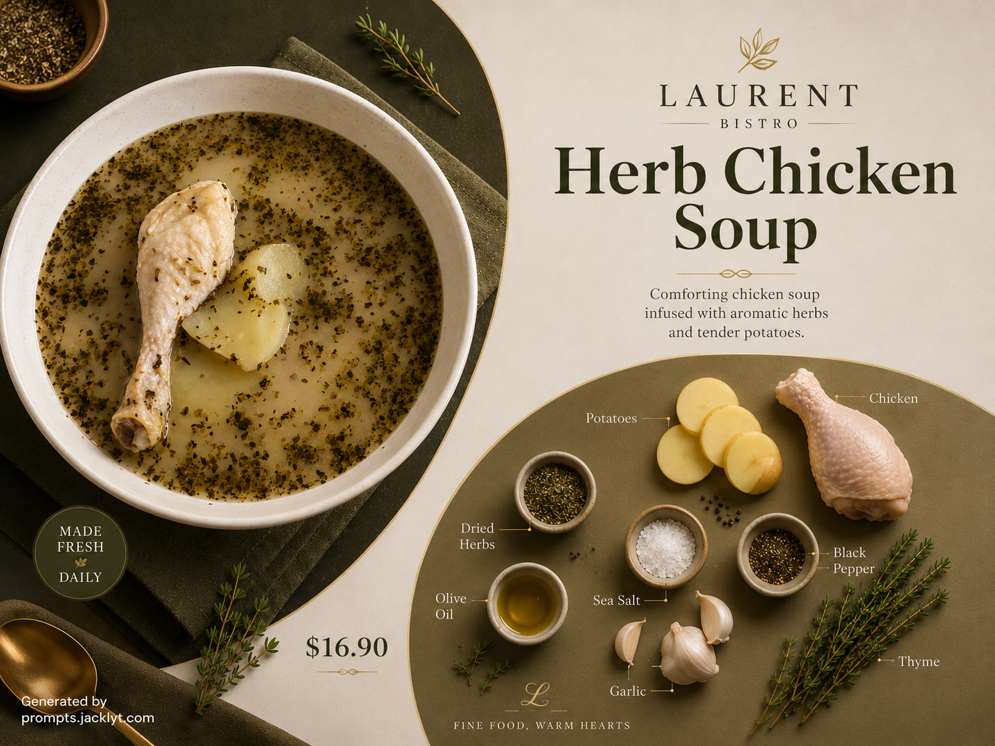
The Branded Snack Technical Infographic prompt turns an uploaded snack or food product image into a premium technical infographic with architectural-style annotations. It is designed for users who want a product visual that feels intelligent, polished and brand-ready: a clean white studio image of the snack combined with fine engineering linework, ingredient callouts, dimensional marks, internal structure diagrams and a controlled brand-color accent.
This template is especially useful because it does more than create a beautiful product render. It transforms the snack into a visual story about construction, texture, ingredients, sourcing and food-engineering precision. The prompt asks the AI to keep the uploaded snack fully visible while adding arrows, labels, section diagrams, measurements, sustainability notes and material behavior callouts. This makes the output feel like a fusion of industrial design documentation, luxury food advertising and educational product storytelling.
The snack name field gives the infographic a clear title and helps the AI understand what product it is explaining. The brand color field controls the accent system. Instead of flooding the whole image with color, the prompt restricts the accent to roughly twenty to thirty percent of the annotation language, with black technical linework remaining dominant. This restraint is important because it keeps the result premium and avoids the childish look common in generic infographics.
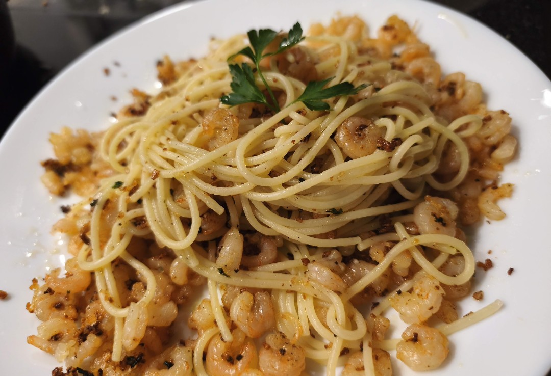
The uploaded image is mandatory and acts as the visual foundation. The prompt tells the model to use the food image as the base, place it on a clean white background, preserve product visibility and overlay the technical system without hiding the snack. It also asks for at least one cross-section visualization and one schematic or sectional diagram, which gives the final image more depth than a simple labeled product photo. The result can feel suitable for modern food brands, social campaigns, pitch decks, packaging concepts, menus or creative product education.
Use this prompt when you want a snack to feel premium, engineered and thoughtfully designed. It works well for cookies, sandwiches, chips, pastry, burgers, filled desserts, protein bars, pasta products, gourmet snacks or any food item with visible layers, ingredients or texture. The best input is a clean image of one product with enough detail for annotations. Keeping the full structured prompt helps the AI balance realism, information design, brand accent color and clean composition.
How to use this prompt
- 1
Upload one clear snack or food product image. The product should be visible, recognizable and not hidden by excessive packaging, hands, plates or background clutter.
- 2
Enter the snack name exactly as you want it to appear in the infographic title area, then choose a brand color that feels premium and appropriate for the product.
- 3
Copy the complete prompt into your AI image tool with the uploaded image. Keep the rules about white background, limited accent color and visible product hierarchy to avoid cluttered infographic results.
Best use cases
Food brands can use this prompt to create premium product-education visuals for social media, launch campaigns, menus, pitch decks or packaging concept presentations.
Designers can explore how a snack could be presented as an engineered product, with layers, dimensions, ingredients and construction logic explained visually.
Content creators can make educational but stylish food posts that explain texture, filling, sourcing or structure in a visually premium way.
Tips for better results
Choose snacks with visible layers or texture. Filled cookies, sandwiches, pastries, bars and stacked foods give the AI more material for cross-sections and technical callouts.
Use a restrained brand color. Muted red, forest green, deep blue, warm gold or earthy orange often feel more premium than neon tones.
If annotations cover too much of the product, regenerate and keep the product-visibility rule. The snack should remain the hero, not disappear under labels.
Common mistakes to avoid
A common mistake is uploading a very busy food scene. The prompt is built for one dominant product on a clean background, so clutter makes the infographic harder to read.
Another mistake is choosing a brand color that overpowers the product. The prompt uses color as an accent, not as a full background or dominant overlay.
Do not remove the rules about clean hierarchy and avoiding overcrowded text. Without them, the infographic can become visually chaotic and less premium.
Final recommendation
Use the Branded Snack Technical Infographic prompt when you want to turn a food product into a premium, educational and brand-aware visual. A clean snack image, a clear product name, a restrained brand color and the full structured prompt help the AI create a polished infographic that feels professional rather than generic.